

Color plays a powerful role in how people perceive and interact with a website. It’s more than just decoration: The right colors can capture attention, create emotional responses, guide users through a page, and even build trust. Whether you’re building a personal portfolio or running an online store, knowing how color theory works helps you design more effectively and intentionally.

Primary Colors
Primary colors form the basis of all other colors. In traditional art and painting, the primary colors are blue, red, and yellow. Primary colors are those that cannot be created by blending other colors. In Web design, where light is the medium, the primary colors shift to red, green, and blue, known as RGB. These digital primary colors are used in screens and displays to create every other color through combinations of light.
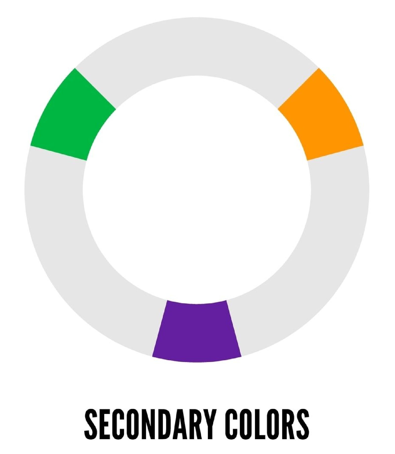
Secondary Colors
Secondary colors are made by mixing two primary colors together. In traditional color theory, combining red and blue creates purple, blue and yellow make green, and red and yellow produce orange. In the RGB color model used in Web design, red and green create yellow, green and blue form cyan, and red and blue make magenta. These secondary hues expand the designer’s palette and are useful for creating contrast and variety.
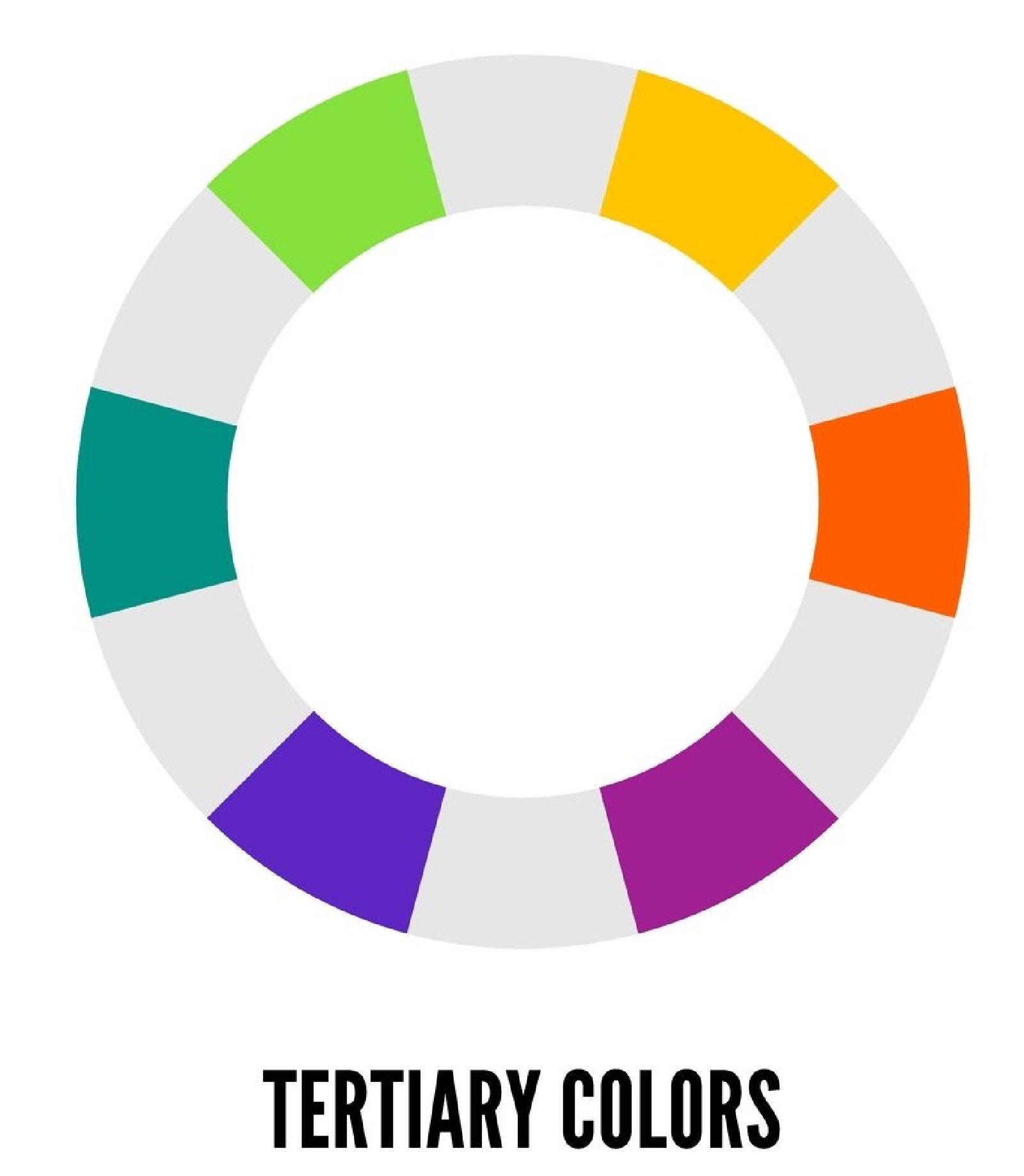
Tertiary Colors
Tertiary colors are created by blending a primary color with a nearby secondary color. These include shades like red-orange, yellow-green, and blue-violet. These in-between colors offer more subtlety and richness. In both art and digital design, tertiary colors help soften transitions and provide greater flexibility when building a complete color scheme.
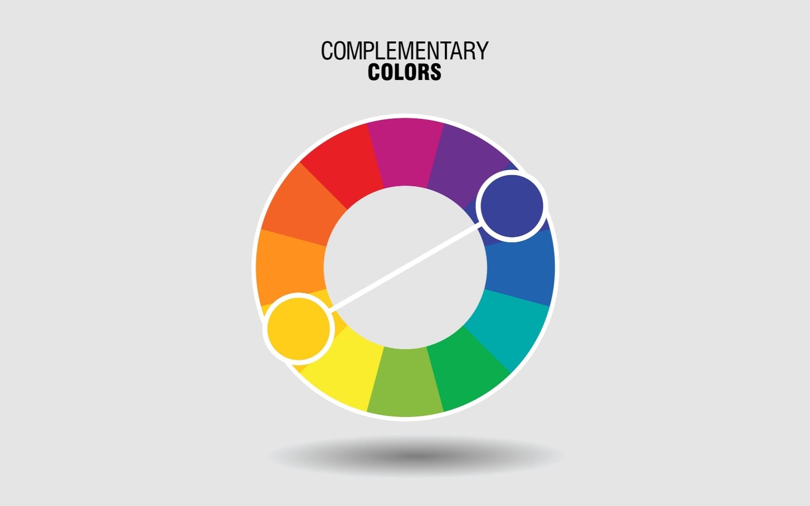
Complementary Colors
Complementary colors are positioned opposite each other on the color wheel. When placed side by side, they create strong contrast and visual energy. Classic pairs include red and green, blue and orange, and yellow and purple. In Web design, complementary colors can be used to draw attention to important buttons, links, or messages. However, they should be used with care, as too much contrast can feel harsh or distracting.

Analogous Colors
Analogous colors are located next to each other on the color wheel and often appear together in nature. They tend to be visually harmonious and easy on the eyes. Combinations like red, red-orange, and orange or blue, blue-green, and green create a sense of flow and unity. These color groups are well-suited for creating a soft, cohesive look across different sections of a website or design.

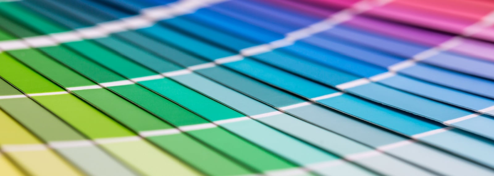
The Color Wheel
The color wheel is a visual tool that organizes colors based on their relationships. It includes primary, secondary, and tertiary colors placed along the edge of a circle. Designers use the wheel to understand how colors contrast with or complement each other. The wheel also helps distinguish between warm colors like reds and oranges, which can feel energetic, and cool colors like blues and greens, which often convey calm and trust. Mastering the color wheel is essential for any designer looking to build attractive, well-balanced visuals.
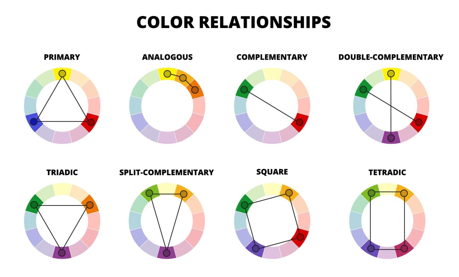
Color Relationships
Color relationships refer to the ways different colors work together. These relationships can create a mood, guide attention, and support branding. A monochromatic relationship uses various shades and tints of a single color, creating a clean and unified look. Complementary relationships use high contrast to emphasize elements. Split-complementary schemes balance contrast with harmony by using a base color and two neighbors of its complement. Triadic relationships use three evenly spaced colors for energy and balance, while tetradic relationships involve two pairs of opposites for complex, vibrant designs. Understanding these relationships allows designers to use color purposefully.

The Painter’s Color Triangle
The painter’s color triangle is based on red, yellow, and blue as the primary colors. This model shows how artists mix paints to create secondary and tertiary colors. The triangle emphasizes pigment-based mixing, where blending physical colors results in new hues. It remains a fundamental concept in traditional art education and still influences how some designers think about color, especially in hand-drawn or illustrative work.
The Printer’s Color Triangle
In contrast to the painter’s model, the printer’s color triangle is based on cyan, magenta, and yellow. This system is used in printing, where colors are created through subtractive mixing. When printed inks are layered, they absorb certain wavelengths and reflect others, producing visible color. Black is added in the CMYK model for deeper contrast and sharper detail. Designers who create materials for both print and the Web need to be aware of how these models differ, as colors may not appear the same on screen as they do on paper.
- Full-Color Preseparated Art: Process Colors
- Additive and Subtractive Color
- CMYK and RGB: Understanding Your Color Modes

The Nine-Part Harmonic Triangle of Goethe
Johann Wolfgang von Goethe developed a color model that focused on emotional perception. His nine-part harmonic triangle groups colors by the feelings they tend to evoke. Instead of focusing on scientific mixing, Goethe’s approach considers how people respond to different hues. For instance, blue might feel serious or peaceful, while yellow gives off a sense of warmth and joy. Red often brings a feeling of excitement or urgency. Though less technical, Goethe’s model is still valuable for designers who want to influence mood and atmosphere through color choices.

Additional Reading on Color and Web Design
- Color Systems Handbook: CMYK, RBG, and More
- Additive Color Mixing
- Primary Colors Are Red, Yellow, and Blue, Right? Not Exactly
- Color Theory Basics
- Choosing Colors for a Web Page
- How to Choose Your Brand Colors
- Graphic Design Color Schemes
- How to Strategically Use Color in Web Design
- Choosing the Right Colors for Your Web Design

Color Theory an Important Part of Live and Recorded Theater
Color theory is a powerful, nonverbal tool in making theatrical stories visually compelling and emotionally resonant. It shapes how audiences emotionally experience a production, be it live theater or a recorded production shown in a home theater. Designers use it to set the mood and tone of the stage, suggest symbolism, and establish relationships or conflict between characters. For example, warm tones like reds and oranges can signal passion, danger, or warmth, while cool tones like blues and greens might indicate calm, isolation, or mystery. Color choices in costumes, theater lighting, and sets help define characters, locations, and narrative shifts—guiding the audience’s attention and emotions without the need for explicit dialogue.
In both live and recorded theater productions, color theory also contributes to visual harmony and the clarity of the storytelling. Lighting designers manipulate color temperatures and gels to enhance realism or create fantastical atmospheres on the stage. Scenic and costume designers coordinate color palettes to ensure contrast, cohesion, and visibility on stage or for the camera. Remember, recorded theater productions intended to be shown to audiences in movie theater seats must not only account for the live aesthetics but also for how colors translate on film, as different hues render differently on screen than in-person.
Home Theater Seating